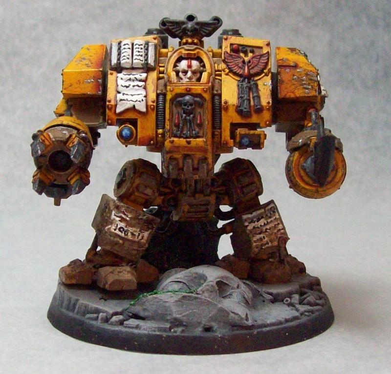
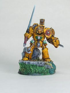
As a continuation of the post I made last week, I'd like to look at past images I've taken of models and what they look like now with proper lighting and no image editing beyond cropping the image.
Lets start with the Gaulrach model I've been using as Fateweaver-
This is the old image I had been using for quite a while now. There seems to be plenty of lighting, but the colors seem off, don't they? The blues appear to be glowing, the purples unnatural, and the plane is obviously apparent by the background line.
These two I took a couple days ago with the new camera and lighting The lighting seems more natural, not overly filtered. The blues no longer look like they glow and the contrast isn't as obviously tweaked as it was in the original image.
This image would look fairly well if it wasn't for the poor lighting. As you can tell, there is more light coming from the left side of the image, leaving the area underneath looking overly dark
In the new images, the lighting is more even, using lighting from above, the front left, and front right areas to evenly distribute the light upon the model. Also, the flash was used in this image, filtered through multiple layers of tissue paper to get just the right effect.
Overall, I'm much happier with the new images. They are cleaner and display the models as they appear without requiring a lot of touch up in paint programs.
Instead of babbling on, I'll just share a couple more photos I took and leave it at that. Till next time, happy gaming!


Nice - the new picture setup really helps! Absolutely love that Eldrad model, too!
ReplyDeleteThanks a lot Mordian! The Eldrad model is one of my absolute favorites. Everything just seemed to fall into place and work while I was painting him.
DeleteYour paintjobs are really nice. I would recommend that you look into Photo Composition and working with Photoshop elements next. I fooled around with your last Eldrad photo over on my blog.
ReplyDeletehttp://tashasbraindump.blogspot.com/2012/10/fooling-around-with-composition.html
I am not an expert, but I have gotten much better with composition since I took a Digital Photography course.
I agree that your mock-up of my image is more dynamic. For now, though, I am quite pleased with how my images look as I am aiming to get the most accurate color representation I can.
DeleteI may graduate to altering the background edges of the images, but for the most part I won't be completely removing the white background for fear of misrepresenting the model and how I completed it.
I like your blog, Tasha, and I look forward to seeing what else you come up with! Thanks for sharing your experience with me!
Nice work man, it's coming along nicely. If you ever have an image you want touched up or want some crazy Photoshop magic done, just send me a message.
ReplyDeleteThanks Richie! I'll definitely take you up on that offer should the need/desire arise :)
DeleteVisit this website
ReplyDeleteVisit this website
Visit this website
Visit this website
Visit this website
Visit this website
Visit this website
Visit this website
Visit this website